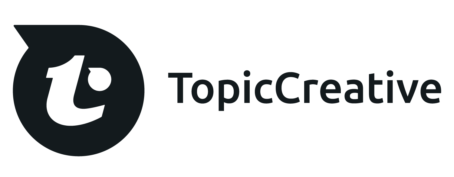
Typography is my favorite medium to work with when it comes to design. I created the mark based off of typography—specifically the letters t, c and and apostrophe flipped horizontally. As you look at the whole mark you notice the lowercase letter t. When you break the letter down into shapes you can see that I have used the apostrophe mark to complete a lowercase letter c. Below you will also see the different concepts I had explored before finally settling on the chosen logo.
