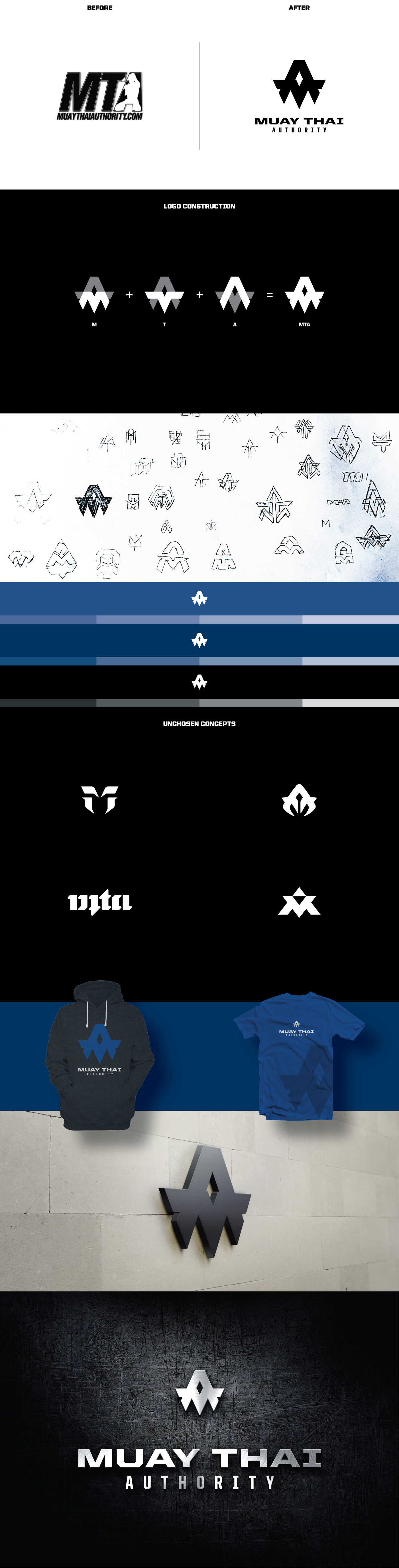
Muay Thai Authority approached me to redesign their current logo. This was especially a difficult task since MTA’s Facebook fan page has a large following (over 1,900,000 followers). MTA's fanbase is already accustomed to the brand and any small alteration can have a direct positive or negative impact on the fans.
I set out to turn MTA into a brand. I wanted fans to be excited about seeing the logo and to proudly want to wear the MTA brand on T-shirts etc. I began by designing a mark, I wanted that to be the focal point as marks/imagery are always easier to remember. Keeping in mind that the mark had to be straightforward, simple and of course memorable I began brainstorming visually. After many ideas and sketches, the chosen mark incorporates the letters M, T and A.
The brushed metal/iron effect was used as a secondary option—my idea came from iron being forged much like a fighter through years of training.