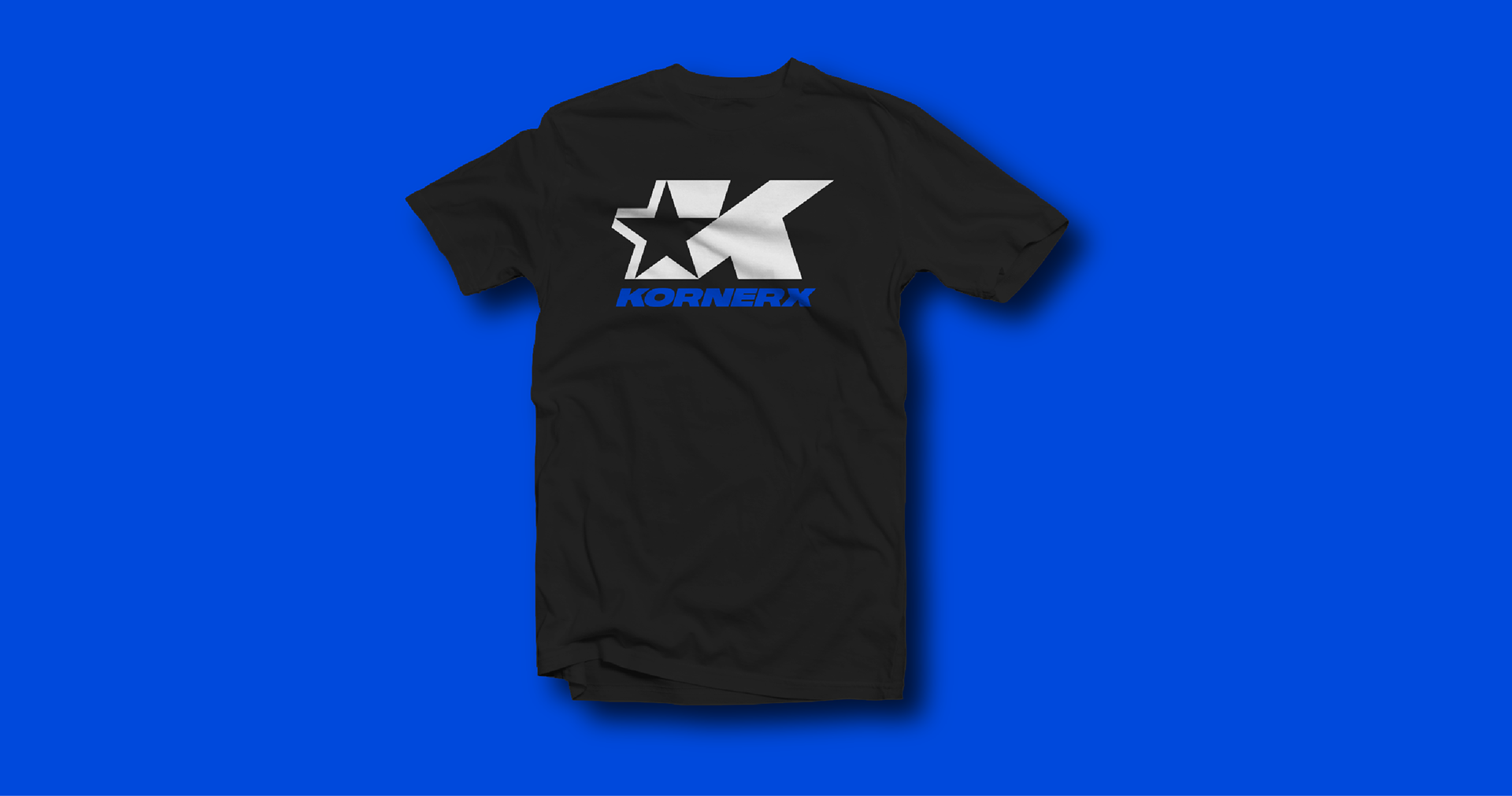
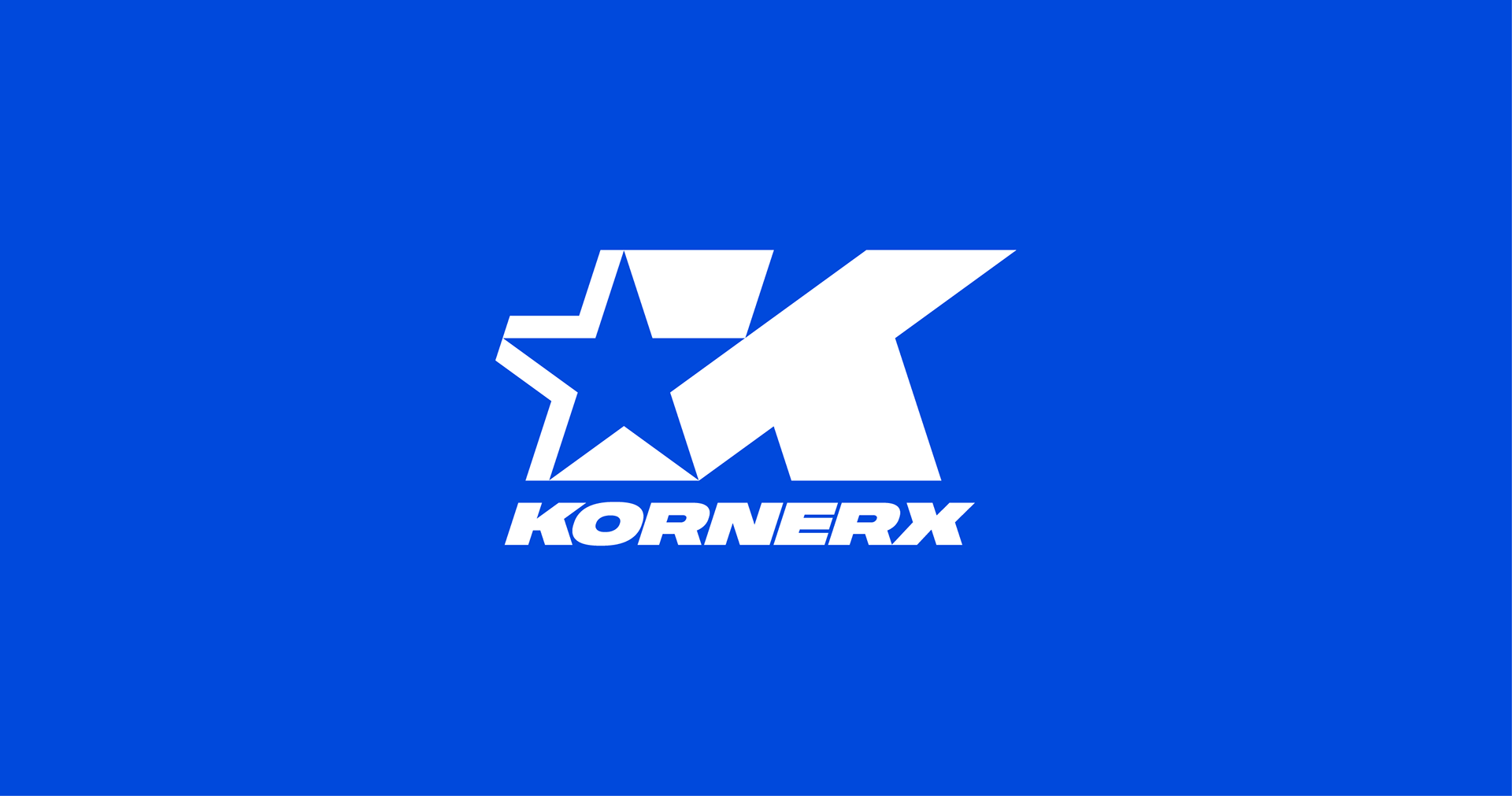
KornerX — Your Extra Cornerman. KornerX a service developed for combat sport athletes who seek an additional “corner man” to either develop a strategy for an upcoming fight or review training and fight footage, giving feedback, suggestions, tips to improve their skills.
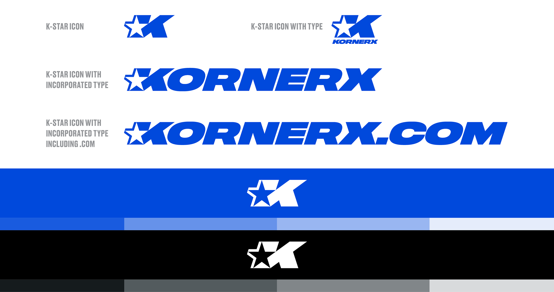
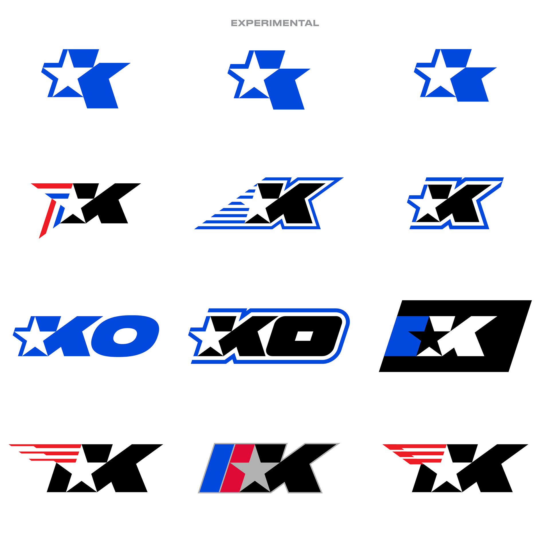
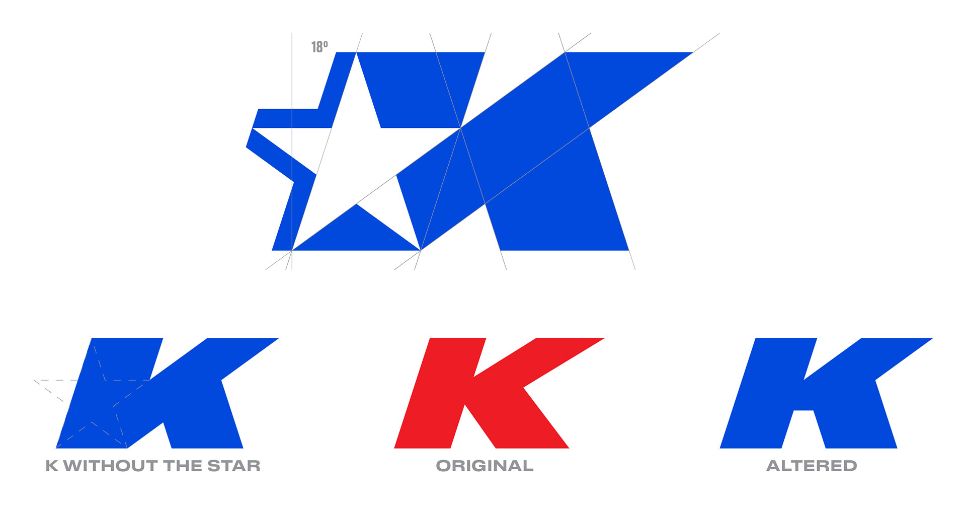
The K mark was developed around the star. Stars have often symbolized guidance — “illuminating the darkness,” excellence and a high quality standard. The letter K is aggressively slanted at an 18° following the angle of the star. This evokes movement and action. The letter K was designed to be wider than a typical type face, showing balance and sturdiness.
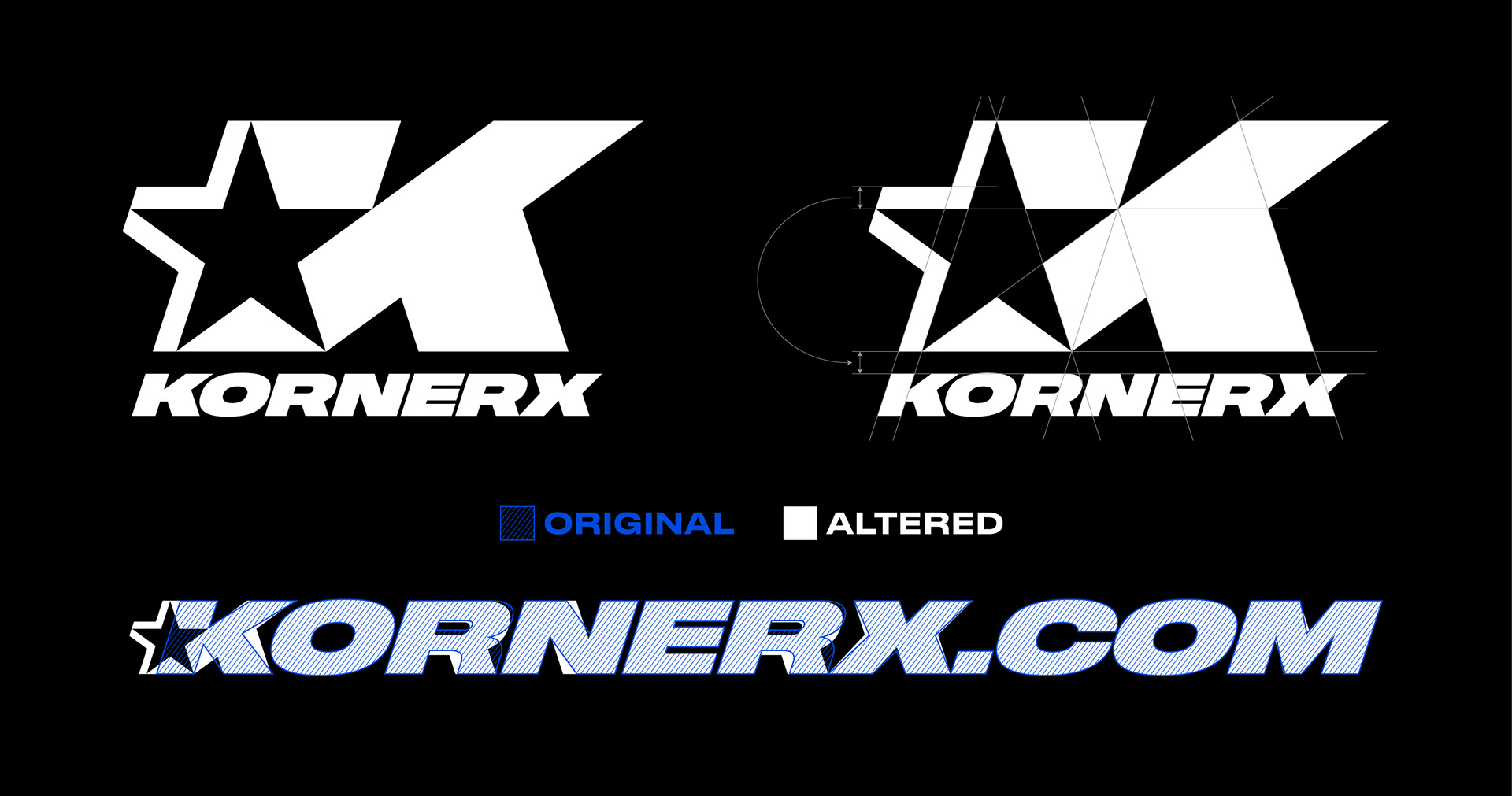
The beginning point for the K-STAR icon is the star. The letter K was developed based on the angles and intersecting points. If the star is eliminated, the letter K would not look optically correct.
The stars stroke or bars were used as a guide for the letter K’s “stem” thickness. The spacing between the K-STAR icon and the typography is also equal to the stars bars. The letter X is slightly protruding beyond the “leg” of the letter K of optical correctness and to follow the legs angle (above).
When the type is used without the star, the letter K is altered to look optically correct (below).
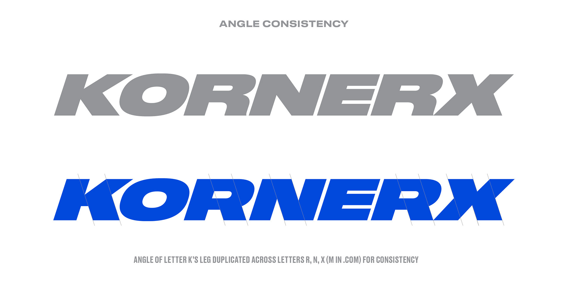
The original typeface was heavily modified to follow the design of the letter K. Letters K, R, N, X and M were altered based on the angle of the “leg” (bottom protruding angle of the letter K).
The angle was then duplicated to the leg of the letter R, the diagonal stroke of the letter N, diagonal strokes on the letter X and letter M.
When used alone, the K-STAR icon is combined with altered typography (without the K-STAR icon). Shown below, is the specific lockup used with the icon and the typeface.