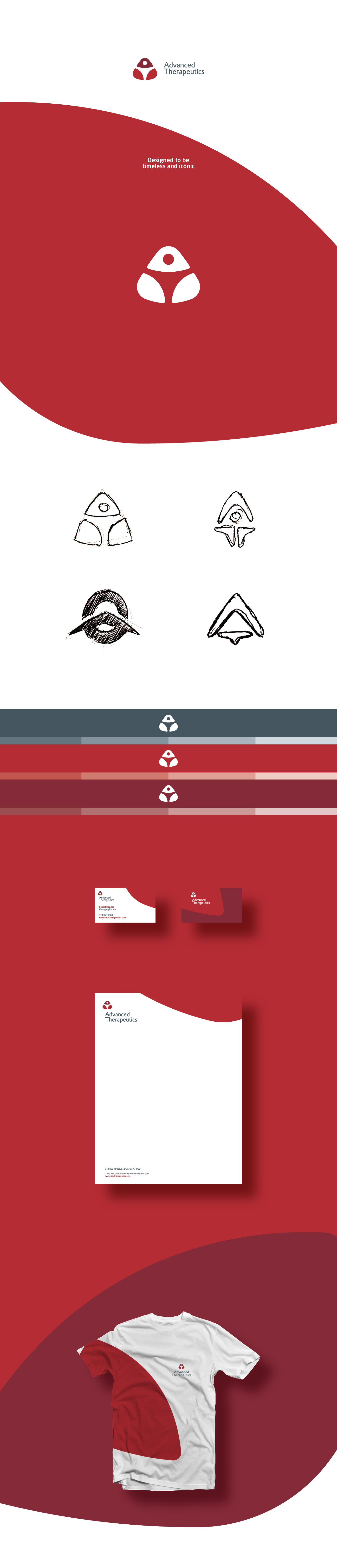
The objective is to improve the total, everyday, physical aspects of the clients in the practice. Massage therapy can be a powerful ally in a healthcare regimen.
The icon which is made up of abstract shapes as a whole forms the letter A for Advanced. Within the mark, a letter T for Therapeutics has been designed in the form of a human being to symbolize the field of therapeutics.
Below you will also see the different concepts I had explored before finally settling on the chosen logo.